Doors Close, New Ones Open

You probably know that talented people at Photodex were, like you, not willing to let it all go, and so with a lot of hard work, they built Photopia. In the interim, however, some of us moved on to other things. I’m one of those people. I’ve been designing for PODs (print-on-demand companies) since 2014, and have stores on both Zazzle and Redbubble. (Links go to my stores on each.)

A year ago, all art came to a halt, a major back “issue” sending me to bed for, not one, not two or three, but four entire months. How many books can we read without going blind? How much TV can we watch before going insane? Maybe I did go a little insane when I started amusing myself with a story about very special cats and one very special dog, typing it out on my laptop. By the time surgery had cured me, the first draft of a novel sat on my laptop. This isn’t surprising, really. I’d spent many years as a professional writer, but it had also been many years since I’d filled 250 pages. It took over 8 months to complete the first draft and then 3 additional months to edit, re-edit, and edit yet again, and then to learn how to publish on Amazon.

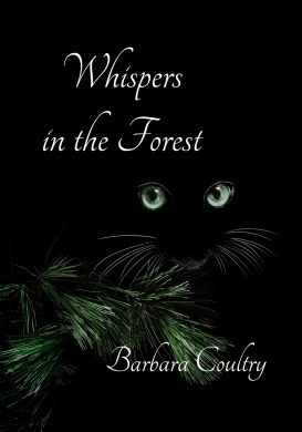
Here it is, a book for all ages, a tale about three cats plus a dog that go into a large forest, taking with them a rare and secret ability to “whisper” to one another. There’s danger and sadness, but there’s also love and laughter. If you love animals, you might enjoy this tale about four very distinct characters. If you’re a heavy reader and have Kindle Unlimited, I’ve set it so you can download the e-book for free:

Another book is brewing in my mind, so life is good. I hope it’s the same for you.

Cheers from Barbara

Published in: on February 1, 2020 at 12:28 pm  Comments Off on Doors Close, New Ones Open  

Nothing New Because…

As you all know, Photodex has ceased creating and updating. Whatever version of the software you own is the end of the line. This doesn’t mean you can’t continue to use it and enjoy it. Though I won’t be adding anything further to this blog, it still has lots of useful information, tips, and tricks for everyone, so I’m leaving it just as it is–available to everyone.

I miss looking forward to new versions of the software I always loved above all others, and I bet you do too, but it’s still great software.

Published in: on October 17, 2019 at 9:47 am  Comments (1)  

Classic Photo Effects in ProShow Producer

Though we can simulate a number of classic photo effects in the Adjustments tab, if we add a mask, we double the chance of success because the mask allows us to multiply and alter any effects we’ve applied to the photo. Try this:

1. Add a photo to a blank slide.
2. Duplicate the photo.
3. Turn the top layer into a grayscale mask. (Photo turns dark, probably too dark.)
4. Change the mask to “Grayscale Inverted.” (Weird.)
5. Select layer 2 in the Adjustments tab, setting White and Black Points to 100%. (Film negative.)
6. Set the mask layer to regular “Grayscale.”
7. Select the mask in the Adjustments tab and set Sharpen to 100%, White Point to 100%, Black Point to -100%, and Contrast to 100%. (Oh my!)

Continue playing, doing anything you want to the layers. Notice how often the mask literally affects the effects.

ADVICE: If you like an effect but want to play some more, duplicate the slide, playing with the copy so you don’t lose the original.

Playing as described above, I created 5 classic photo effects:

Posterize: Simulates a soft wash of color with black ink giving definition.

Classic Posterize

Photocopy: Harks back to old photocopiers that turned photos into b&w graphics.

Classic Photocopy

Antique Photo: A soft sepia with sharp edges and an optional mask to create torn edges.

Classic Antique

Grain: There was no way around it–an extra layer was required for the grain.

Classic Grain

Soft Focus: This can’t be properly achieved by just blurring a photo. The result is a blurry photo. By masking the photo, sharpness can be added back in.

Classic Soft Focus

All 5 effects are available as a free set of styles called “Classic Photo Styles.” Go to The Frame Locker and click on “Free” at the bottom of the page.

Play with your own layers! Play with the styles you’ve been given! Have fun!


Published in: on June 18, 2016 at 2:19 pm  Comments Off on Classic Photo Effects in ProShow Producer  
Tags: , , , , , , , , , , , ,

Producer 7 – Glue Text to Image in a Heartbeat

Before Producer 7: Say you had a heart that rotated and zoomed in, and you wanted “I Love You” glued to the middle of the heart. You created the text, built keyframes for it identical to the heart’s keyframes, watched out for size and positioning, and then you prayed…a lot.

Heart in Motion

Producer 7, bless its heart, has given us “Convert Layer, ” which is easily overlooked because it’s in a right-click menu.

Let’s keep the heart example to show how it’s done, but before anything else, make your heart do everything you want–pan, rotate, zoom or tilt, any combination of effects–and then when done, you’ll be able to glue text to it in a snap.

1. Duplicate the image:

Duplication

2. Right-click the duplicate and choose Convert to Layer > Convert to Text Layer:

Convert to Text

3. Type your text into the popup box and click OK:

Add Text

4. Resize the Options screen to its smallest so you can move it aside to uncover the main preview. While keeping an eye on the preview, change font, size, color, and position (if necessary) in the Text Settings tab.

Text unchanged:

Text Unedited

Text edited:

Text Edited

Run the slide to see how your text remains absolutely glued to the image. It’s so easy that you’ll be gluing stuff all over the place.

Published in: on May 31, 2016 at 12:39 pm  Comments Off on Producer 7 – Glue Text to Image in a Heartbeat  
Tags: , , , , ,

Photo & Caption Moving in Sync

Scenario: You want to pan in a photo with a caption, and you want them to maintain the same distance from each other throughout.

To do this, we’ll use a text layer because raw captions use confusingly different numbers for positioning. A text layer uses the same positioning as an image.

Here’s how to do it:

1. In Slide Options, right-click the preview, select Define Grid, and set both boxes to 2. This divides the screen in half horizontally and vertically…

Grid

2. Type a caption, and choose “Flush Left.” If it’s long enough that it goes off the screen, use the Enter key to break it up into shorter lines.

3. With the grid lines as a guide, move the caption so it’s centered vertically and horizontally, using the dots on the caption’s bounding lines to center it. The green arrows in the illustration below point out the dots.

Caption Setup

4. Convert the caption to a text layer.

5. Add a portrait photo. In Layer Settings, move it to the left of the vertical line, positioning it at -20,0.

6. In Layer Settings, move the text layer to 20,0. The illustration below shows how it might look…

Photo-Text Position

7. Turn off the grid. You no longer need it.

8. In the Effects tab, move keyframe 1 of both the text layer and the photo layer to 2 seconds.

9. Add a keyframe at the zero point in both the text layer and the photo layer…

Add Keyframes

10. In the Effects tab, select keyframe 1 of the text layer and set its position to -70,0. (We’ve moved it left 20 places to the zero point, and then an additional 70 places offscreen. In total, that’s 90 places.)

11. Still in the Effects tab, select the keyframe 1 of the photo layer and move it exactly 90 places to the left from its original position of -20. Since -20 plus -90 equals -110, the setting will be -110,0.

Run the slide, noting how the text and photo move into position without ever getting out of step with each other.

The Rule: For two layers to move in unison, they must travel the same distance in the same amount of time. In the example, we used a distance of 90 and a time of 2 seconds, but when doing this for yourself, your initial positions and timing may be different, but the rule still applies. Same distance, same amount of time.

You can see the technique being used right at the very beginning of The Frame Locker’s video for Changeable Plaid.

By the way, I used Flush Left for the caption because changing the words wouldn’t alter the starting position. If the photo had been on the right, the caption would have to be Flush Right. To see why, bring back the grid created in step 1, add a short caption, and choose Flush Left. Next, choose Flush Right. Flush Left is immediately to the right of the center line, and Flush Right is immediately to the left of the center line. Yeah, I know, it can take some getting used to.