Categorizing and Backing Up Styles

You’re perfectly happy wandering all over the place in search of a style you know for a fact is there.
Your hard drive will never suffer a heart attack.
You’ll never need or want a new computer.
You’re in denial.

CATEGORIZING

Now that you’ve admitted the problem, let’s look at categorizing your styles so you can stop the frantic searching and also be prepared. Here’s how to change or add categories:

1. Click the “fx – Effects” button ( or use “Tools > Manage Effects” or press Ctrl+E) to bring up the Effects screen.
2. Choose a category, and within that category, select the slide style(s) you want to recategorize.
3. At the bottom, click the Categorize button to bring up the editing window.
4. What you can do:

  • Add checkmarks to categories where you want to include the chosen styles.
  • Remove checkmarks for categories where you don’t want the style(s) included.
  • Click the “+add” button to create an entirely new category of your own making.

5. When finished editing, click “Apply” to save your changes.

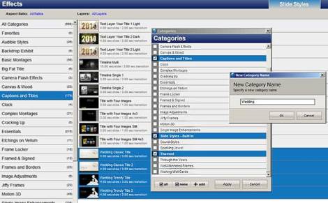
Let’s say you do lots of wedding shows and have various styles suitable for weddings. In Photodex’s “Captions and Titles” category, there are 4 wedding styles. Wouldn’t it be easier if all your wedding styles plus those title styles were included in a category called “Wedding”? Indeed, it would:

1. Bring up the Effects screen.
2. Find the “Captions and Titles” category and select it.
3. Scroll to the bottom of the list where you’ll see the 4 wedding title styles.
4. Select all 4 styles by clicking on the first one, and while holding the Shift key, click on the last one.
5. Click the “categorize” button.
6. Click the “+add” button.
7. Type “Wedding” in the New Category Name box, and click “Ok”.
8. A new Wedding category will appear. It will be checkmarked and highlighted.
9. Click the “Apply” button.
10. Locate your other wedding styles, select them, and choose to add them to the Wedding category.

Here’s what creating a new category looks like:

Category Window

After you go through this process one or two times, you’ll see how quick and easy it is.

BACKING UP

NOTE: Back up only those built-in styles for which you’ve modified the categories. Otherwise, if you reinstall ProShow and reload your styles, ProShow will question your sanity about every built-in style, asking if you want to overwrite it. For those built-ins you’ve actually changed, and to retain those changes, you must answer “Yes.” You do NOT want to go through this for every last one of the built-ins!

Here’s a comprehensive backup plan:

1. Create a folder on your hard drive called Styles.
2. Inside the Styles folder, create sub-folders, one for each category you’ve created or are part of purchased styles. Add one more folder called Built-ins.
3. Using the Effects screen, select each category, ignoring any built-in category containing styles you haven’t changed.
4. Selecting one category at a time, highlight all the styles inside it, click “export,” browse to the matching folder you created, and click “Save.”
5. Do this for all the categories you’ve created.
6. Whenever you change or add a style, export it to the appropriate folder. (Add Photodex’s styles to the Built-ins folder.)
7. Final step: Whenever you’ve made a number of changes, burn the Styles folder to a backup disk. Someday you’ll need it.
Colorize vs. Hue

Anyone who’s played with the separate functions of Colorize and Hue has, no doubt, seen that there’s a distinct difference, meaning there may be a reason to choose one over the other. Basically, Hue changes colors individually, while Colorize changes everything into a single color. Since a picture is worth a thousand words…

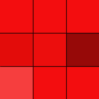
Original:

Original Graphic

Hue slider (still a color array, but they’ve all changed except for the center gray):

Hue slider

Colorize (now it’s all one color, including the center gray):

Colorize

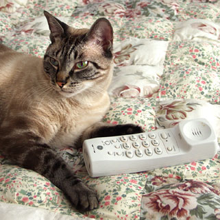
Original:

Original

Hue (colors have changed, but not the grays and blacks):

Photo hue

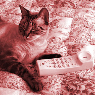
Colorize (it’s now monochrome–there are no neutrals):

Photo colorized

Is one choice better than the other? Absolutely not. The Hue slider is often the better choice for graphics, but Colorize is usually better for photos. Using Colorize, for example, you can turn a modern, full-color photo into a sepia-tinted old photo. Using the Hue slider on a photo is likely to create something odd (orange eyes, perhaps?) unless you’re going for modern art. However, did you notice what Colorize did to the graphic? It wiped out every color except for red. Even the gray was turned red. Gray is the color of shadows, and so if you have a graphic that contains shading, stick with the Hue slider.

Published in: on December 8, 2013 at 4:53 pm  Comments Off on Colorize vs. Hue  
Tags: , , , ,

Captions Beneath Layers in ProShow Producer – Easy!

NOTE: As of Producer 6, you don’t need this article. If you have an older model, then go ahead and read.

To place a caption beneath an image layer, we’re told to create the caption on a transparent background in an image editor and then save it as a PNG file. There’s another way, and it’s easy:

1. In a blank slide type your caption in any font and color. If it’s a dark color, set the background to white. Otherwise, keep the default black background.

2. Close the Options screen, and with your caption showing in the main preview , right-click the preview, choose Capture Frame, give it a name, browse to a folder where you want to save the capture, and click ‘Ok’.

3. Add your newly minted caption layer to the slide you created it for, placing the caption beneath whatever image you like.

4. With the caption layer selected and in the Adjustments tab, click the Chroma Key button.

5. If the caption is on a white background, change the default black ‘Key Color’ to white, and then use these settings: Intensity Threshold = 10% and Intensity Drop Off = 35%.

6. Click ‘Done.’

That’s it. Now you can treat your caption in all the same ways you would any other image, using pan, zoom, tilt, rotate, etc.

Published in: on October 17, 2013 at 2:26 pm  Comments Off on Captions Beneath Layers in ProShow Producer – Easy!  
Tags: , ,

Any Number You Want

No matter how it looks, you aren’t limited to default settings in ProShow. Here’s the truth:

ZOOM – Sometimes a setting such as 103 is too small while 104 is too large. No problem. Type in a decimal such as 103.5, and you’ll have just what you need. If you leave the slide and then go back to it, you’ll find that the number has been rounded off, but don’t be fooled. Beneath the hood, your decimal number is still there.

ROTATION – Do you want an object to spin like a top? You probably already know you can go from -360 degrees to +360 degrees, (two full rotations), but you can also make it spin from -720 degrees to +720 degrees or from -980 degrees to +980 degrees or from whatever to whatever you like.

TILT – What holds true for rotation also holds true for tilt, but in this case, instead of spinning clockwise or counterclockwise, the object will appear spin on a vertical axis like a weather vane.

FONT POINT SIZE – Don’t believe for one minute that the largest you can go is up to 120 points. Type in any point size you want…any. If 56 is too small and 72 is too large, type in 60 or 63 or whatever suits.

All you need remember is that, if there’s a box where you can enter a number, you’re free to enter any number you want.

Published in: on September 1, 2013 at 2:34 pm  Comments Off on Any Number You Want  
Tags: , ,

ProShow Speed Demons

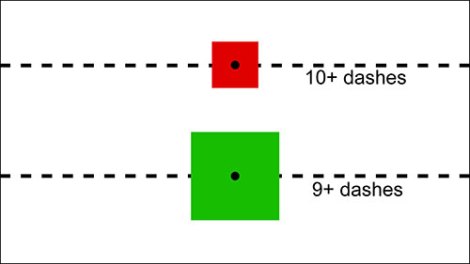
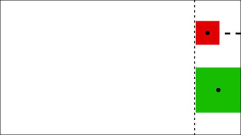
I recently helped someone get a cutout of Mickey Mouse to go from the right side of the screen to the left side of the screen in lockstep with a second layer, both Mickey and the other layer starting and finishing at the same time. As easy as this may seem in concept, it’s actually the root cause of baldness, particularly with PNG files where we don’t easily see the problem. The illustration below represents two layers, one a small red square, one a larger green square, and dashes showing distance:

Notice there’s more distance between the edge of the red square and the edge of the screen than there is for the green square. Someone has a longer distance to travel–namely the red square.

Trying to get differently sized images like these squares to travel in sync across the screen is a nightmare…

One-third of the way across

Two-thirds of the way across

Awful, isn’t it? They’re each marching to a different drummer.

So, let’s say we have a small red square in one layer and a large green square in a second layer, and we want the left edges of each to be in perfect alignment as they travel from right to left. In the illustration below, notice the vertical dashed line, which represents a guideline. It was derived from butting up the green square to the right side, then drawing a line so it coincided with the left side of the square. The red square was then moved so its left side was also against the dashed line:

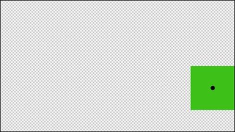
For this example and in an image editor, I made the dimensions of the green square’s file 1600 pixels by 900 pixels, which is a 16:9 ratio, and then moved the square to the extreme right edge. Then I dragged the red square into the same file so I had 2 layers. Using a guideline (which I forgot to show here, but which is just like the dashed line above), I placed it on the left edge of the large square and then moved the small square up next to that same guideline. Once that was done, I saved each layer as a separate PNG file. The images ended up looking like this:

With these 2 files, the rest was a piece of cake. In ProShow, I added the two files to a slide and moved the layers so the left sides of the squares were lined up on the left side of the screen just barely out of sight, making sure both layers had identical horizontal pan settings. I then sent both layers over to -100. They traveled as if joined at the hip. Job done, hair still on head.

Here are the results:

One-third of the way across

Two-thirds of the way across

Published in: on November 20, 2011 at 1:00 pm  Comments (2)  
Tags: , ,